TOPSHOP STYLE LOOKBOOK:

1372546

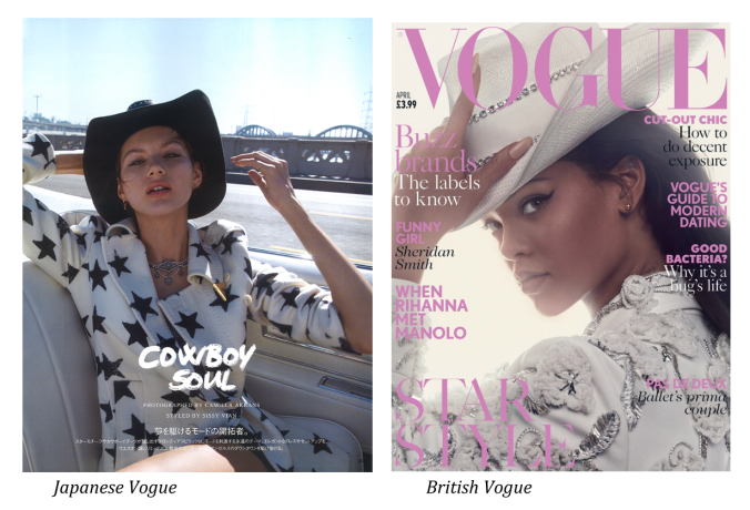
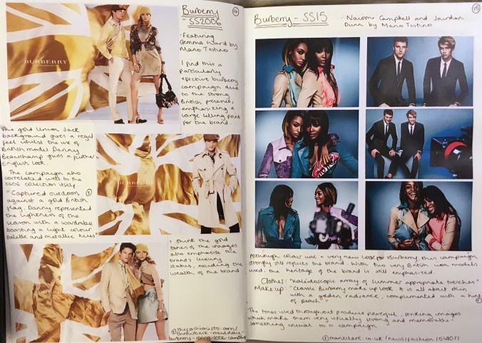
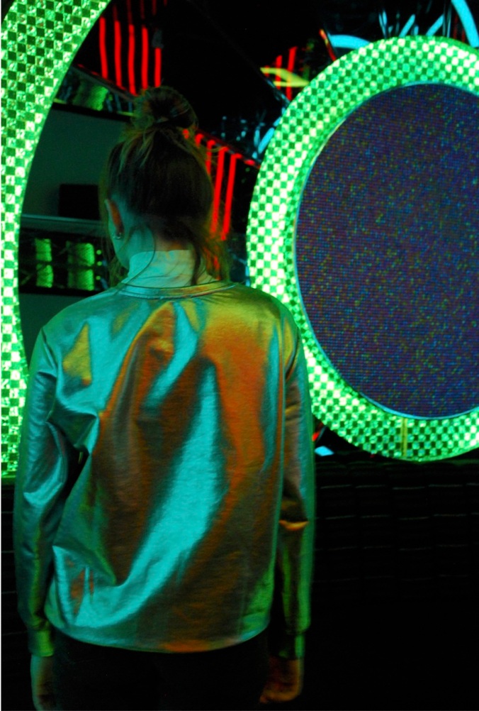
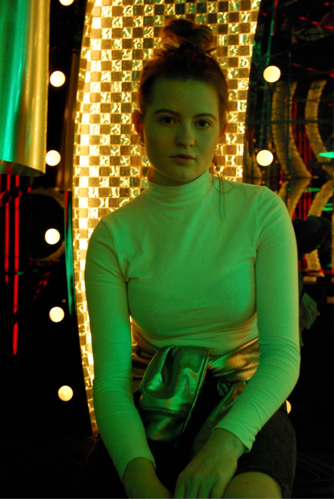
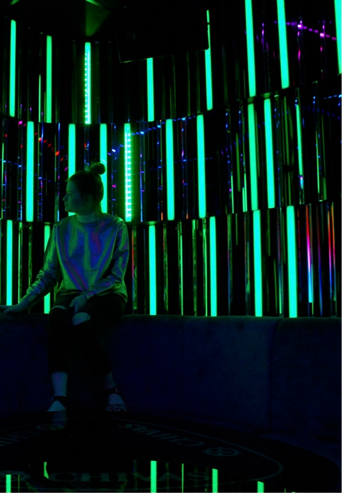
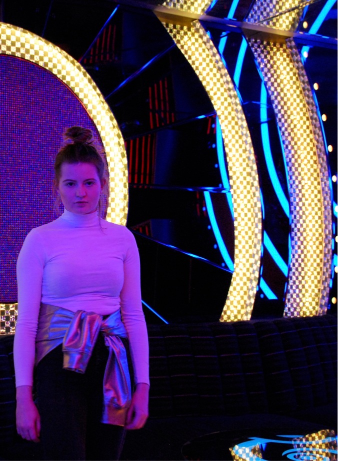
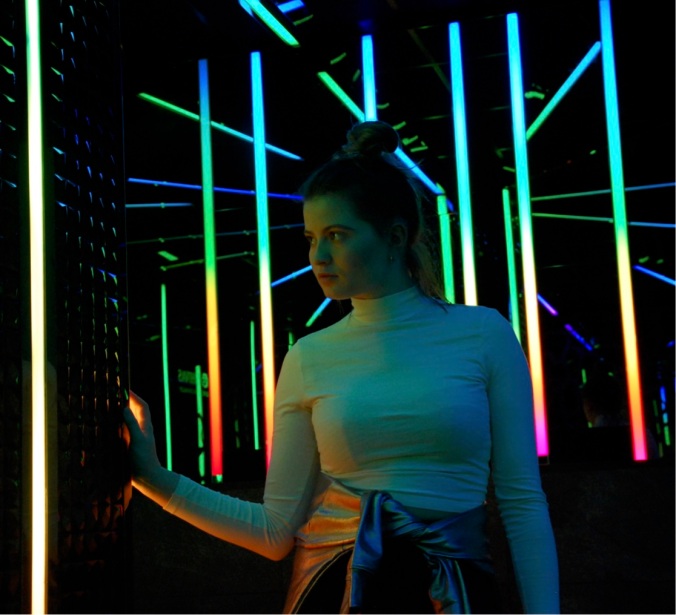
Having researched the metallic trend and studying Topshop in detail, this is the lookbook i produced for my final result. The location I chose is a karaoke bar in China town in Manchester which has amazing lights throughout the whole place. I chose this in order to reflect the colours on to the metallic clothing, and show it off better. I then turned this into a physical lookbook for handing in.

PREVIOUS TEST SHOOTS:

DSC_0264.JPGDSC_0262.JPGDSC_0269.JPG

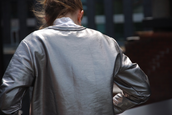
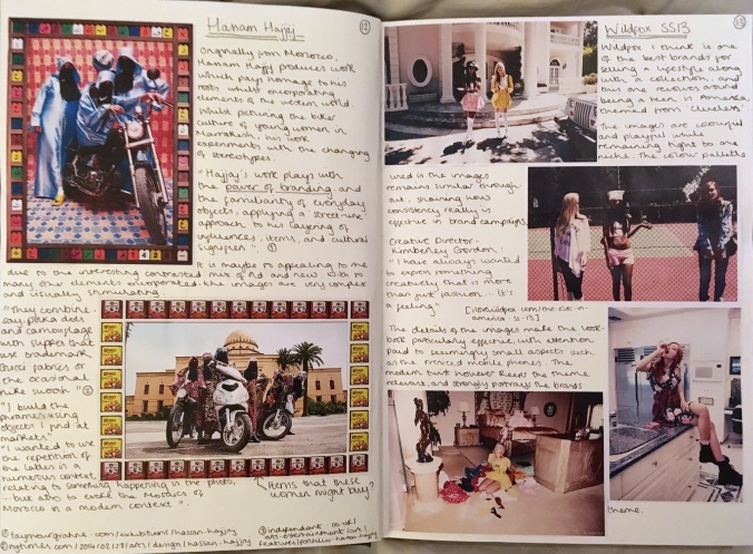
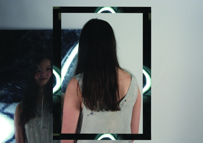
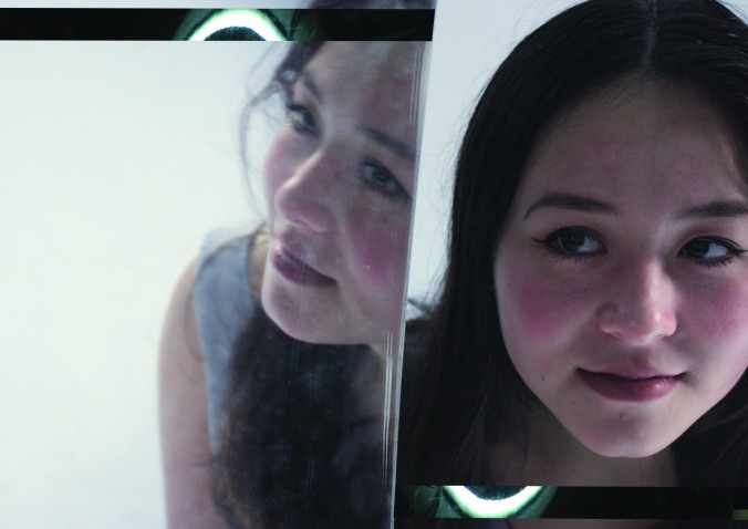
In this test shoot I chose an industiral location with many windows- I was interested to see how the metallic would work alongide reflective backgrounds. Although I like these images, the reflective idea could be carried out more obvoiusly.

DSC_0213.JPGDSC_0218.JPGDSC_0210.JPG

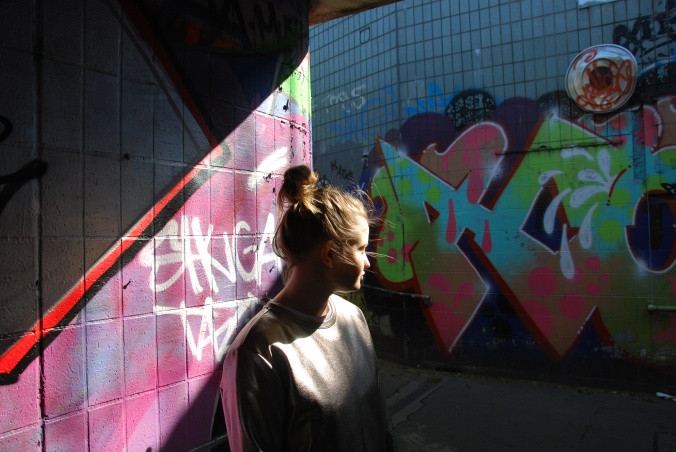
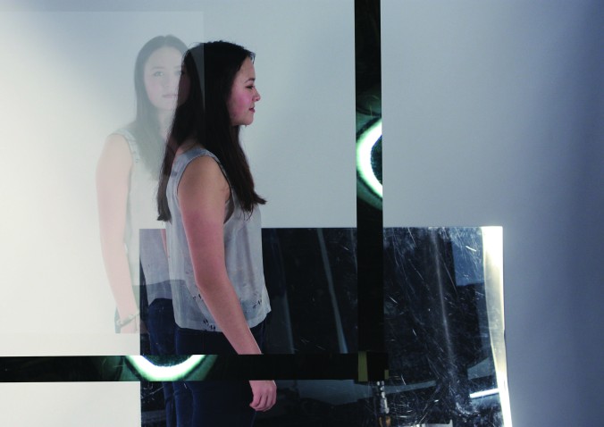
In this Test shoot I chose a graphited location. Although this background and light worked well for adding colour to the shoot, I wanted to try something more advneturous.

RESEARCHING THE SHOOTS:

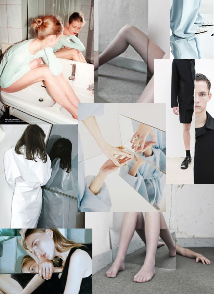
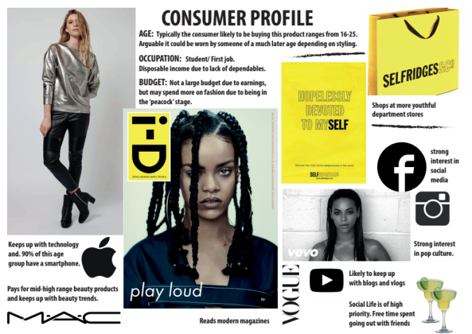
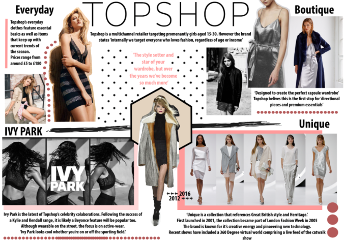
In order to prepare for the Topshop based shoot, I researched into the brand, their consumer base and their competition. These boards I created to visually show some of the information that I found.For the final product board, I focused on the metallic sweatshirt shown above. I chose a metallic item due to the trend focused research I previously carried out through WGSN.

page7

pagess

screen-shot-2016-11-18-at-18-19-08screen-shot-2016-11-18-at-18-22-47

SKETCHBOOK FOR THIS PROJECT:

page1page4_Page_07.pngpage2page3page4_Page_19.pngpage4_Page_24.pngpage4_Page_38.pngpage4_Page_37.png
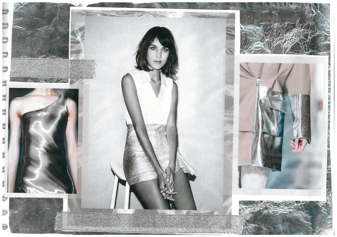
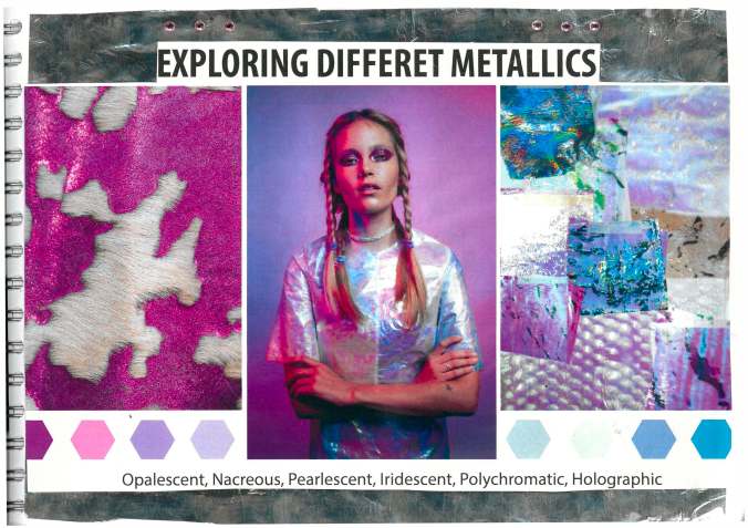
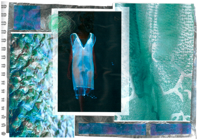
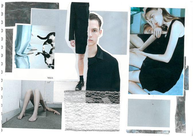
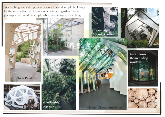
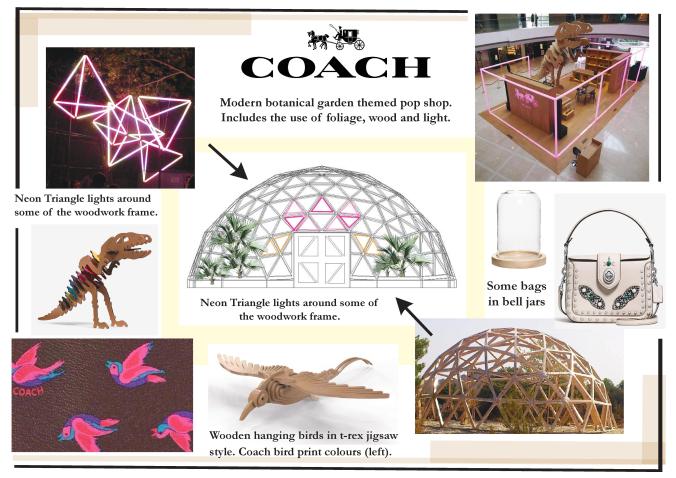
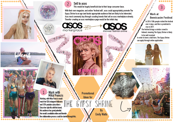
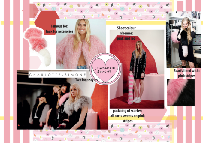
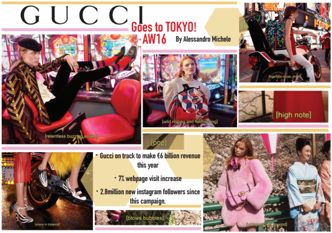
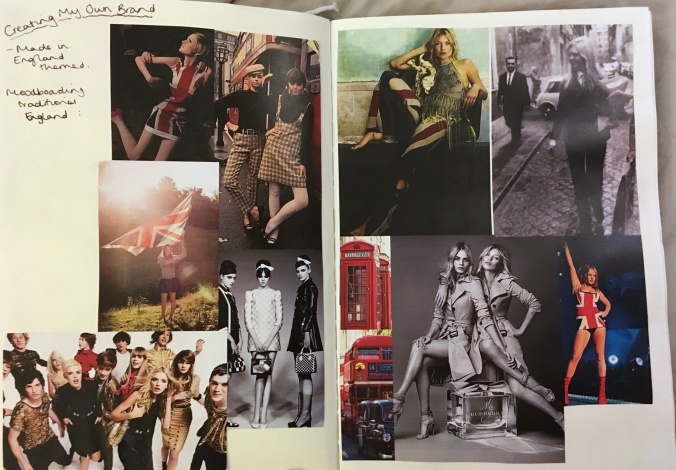
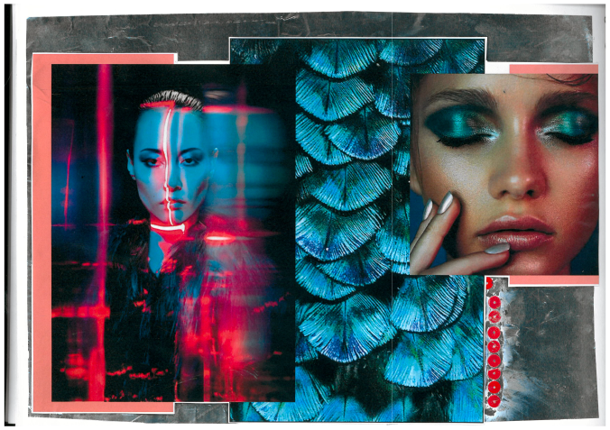
Below are some images of my sketchbook- here I researched the shoots I planned through various moodboards. I also went more in depth into the marketing for the shoot and how it would reach the target consumer.

SEE THE FULL SKETCHBOOK HERE.

British Vogue v. Vogue Japan report:

A first year project at Manchester Fashion Institute- An comparison of the two different VOGUEs and their consumers.This looked in depth at the difference in styling, celebrity cultures, editorials, photography and pop culture included in the two issues. I loved studying this and gained a first in this report. Full report HERE.

Screen Shot 2017-03-26 at 18.15.30.png

River Island Visual Report.

I have also created a report that looks into the business River Island, their products, strategies, promotion, as well as a visual merchandising analysis. I am particularly proud of this report as I went on to gain the top mark in my year for this assessment.

Full Report HERE.

MARKETING STRATEGY- GFW


2ND YEAR DIGITAL PROMOTION ASSIGNMENT-

Integrated marketing strategy for Graduate Fashion Week- Aiming to sell the maximum amount of tickets to the event through increasing awareness. My strategy included events prior, during and post the event itself.

The main strategies include gaining more digital influencer attendees, more digital sponsors such as Kodak and Business of Fashion, and increasing the number of creative university students attending.

This slideshow requires JavaScript.

Below are some sections of the strategy. Full marketing strategy directly below:

digital-strategy-emily-watts


Creative Branding Project

screen-shot-2016-11-18-at-21-07-13screen-shot-2016-11-18-at-18-19-49screen-shot-2016-11-17-at-19-34-40

A recent project at uni meant we had to create a new product (and it’s packaging) for an already existing brand. I chose to study Charlotte Simone, and what a lip balm might look like if they produced one. This project meant looking in depth at the tone of voice of brands, the fonts they use and the colour schemes they choose.

Since pink stripes, an all-sorts inspired pattern, and fur are all signature styles of charlotte Simone, I included these three aspects. My personal favourite beauty product is natural paw paw balm, so I looked into how the brand might sell this by studying what it is that consumers buy into when approaching beauty products.

The final aspect to the product was to write an editorial featuring the product, which enabled me to learn about beauty journalism in more detail.

Presentation: Gucci AW16

screen-shot-2016-11-18-at-21-06-48

Being a fan of GUCCI AW16, I chose to do one of my uni presentations of this campaign- creatively directed by Alessandro Michele. I produced this moodboard to visually accompany my presentation. I spoke about the change in image and branding, and the success that followed with this.

EFFECTS OF THE GUCCI CAMPAIGN:

  • This campaign was hugely promoted by Hearst magazines. Elle stated it was their favourite GUCCI campaign to date, and Harper’s Bazaar called it one of the best campaigns of 2016
  • The images themselves are cinematic and subtly surreal- which helps to make the campaign aspirational and encourage the idea that by buying gucci, consumers are buying into this lifestyle.
  • Since the release of this campaign, the Gucci website has seen a 7% increase in web page visits. They have also gained 2.8 million new followers on instagram- a 25% follower base increase in just 4 months.
  • The brand is now on track to make a revenue of 6billion euros, in comparison to 4.5billion this time last year.

British Style Shoot- In studio

final2final1-2

screen-shot-2016-11-18-at-16-35-03

A Leeds College of Art project to show a clothing brand who’s unique selling point is that the clothes are made in England. I therefor did a shoot inspired by tennis styling- something stereotypically British.This meant putting my model, Clemmy, in a mesh dress. I would have liked to experimented with location more, if the time given for the assessment had been given.

SKETCHBOOK FOR THIS PROJECT:

IMG_9267IMG_9266IMG_9265IMG_9264